5 Mistakes to Avoid When Selecting Wall Murals for Small Spaces
Small rooms punish the wrong mural. See the five slip-ups with scale, colour, wall choice, finish and prep, and the simple fix for each one before you order.
- Bin
- Household
- Box code
HSH 04- Added
- Re-labelled
- Read time
- 3 min read
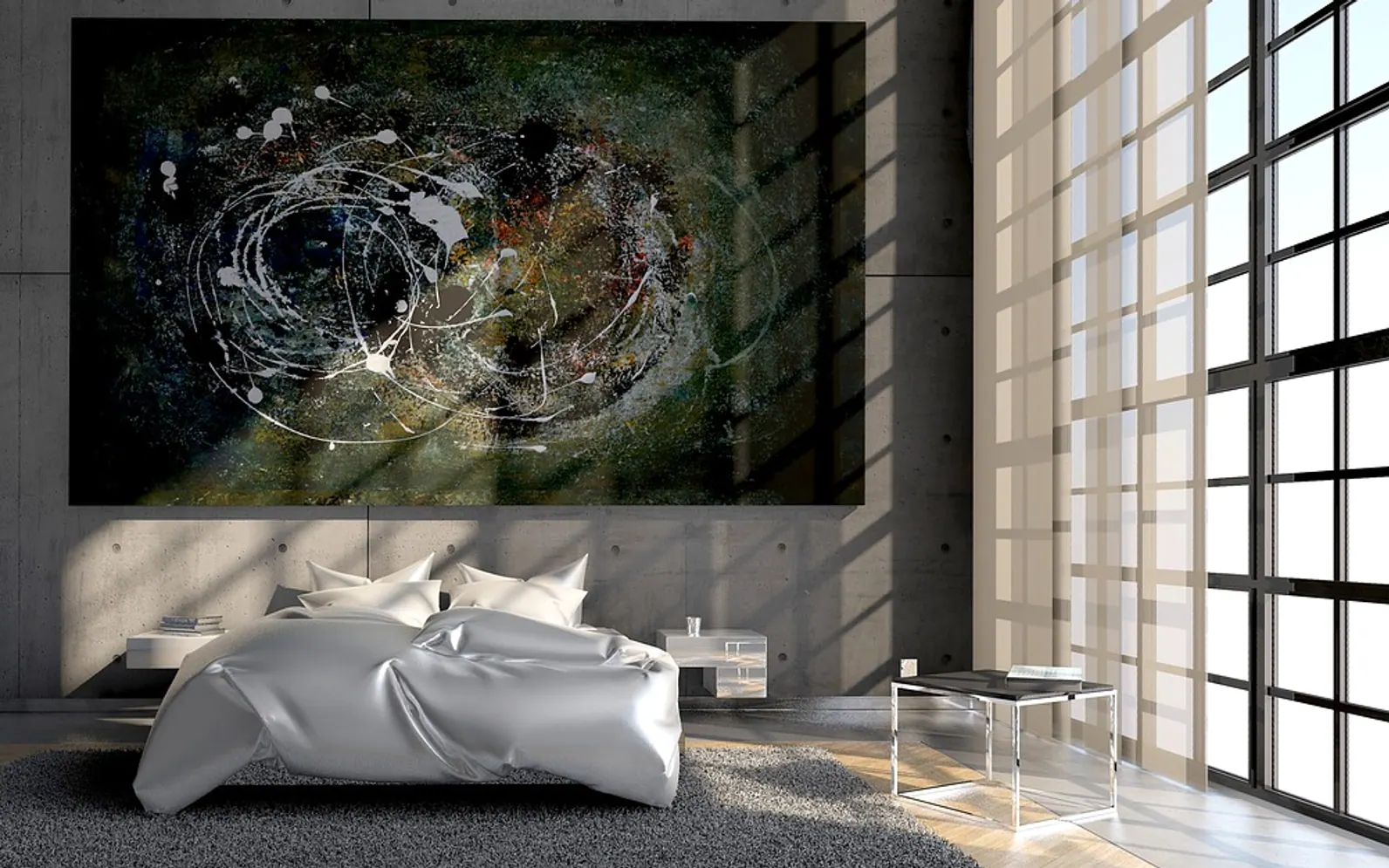
A single papered wall can change how a compact room feels more than any new sofa. The catch is that small rooms are unforgiving: an image that looks striking in a showroom photo can crowd a box room or a narrow hallway once it is up. The five slip-ups below come up again and again, and each one has a straightforward fix.
1. Letting the motif outgrow the room
Scale is the first thing the eye reads. Giant leaves, oversized faces or bold blocks of geometry make a wall feel closer than it is, because we instinctively measure the room against the pattern. In a small space, finer repeats or scenes with a clear sense of distance work harder for you. A forest path fading into mist, a horizon set low on the wall or a soft architectural view all pull the gaze outward instead of pushing it back.
Check the motif against the furniture that will stand in front of it. If the most interesting part of the design ends up hidden behind a headboard or a bookcase, look for a layout whose focal point lands above or beside it.
2. Picking a palette that swallows the light
Deep inky tones have their place, but in a room with one small window they soak up what little daylight arrives. Very saturated colour can tip the other way and feel restless at close range. Pale backgrounds, muted naturals and tonal designs built from two or three related shades tend to make walls recede. If you love drama, keep it to a band of darker colour near the floor and let the upper half breathe.
Renters, and anyone who changes their mind often, can test ideas with self adhesive wall murals, which come in plenty of light, airy designs and can be repositioned or lifted later, so a palette that disappoints in evening light is easy to rethink.
3. Choosing the busiest wall
A mural competing with a radiator, two shelves, a television and a row of coat hooks loses every time. The image breaks into fragments and the whole room reads as cluttered. Pick the wall with the fewest interruptions, ideally one that is already the natural focus when you walk in. In bedrooms that is usually the wall behind the bed; in a hallway, the end wall you see from the front door.
Ceilings and alcoves deserve a thought too. A gentle sky or a quiet texture overhead can lift a low room, and a papered alcove adds a sense of depth without touching the main walls at all.
4. Ignoring the finish and the light it reflects
Matte, satin and gloss surfaces behave very differently. A shiny finish opposite a window can throw glare that hides the picture for part of the day, while a flat matte surface keeps colours calm from every angle. Texture matters as well: a subtle linen or plaster effect adds interest up close without adding visual weight from across the room. Ask for a sample and tape it up for a few days to watch it in morning and evening light.
5. Skipping the measuring and prep
Small rooms leave little margin for error. Walls are rarely perfectly square, sockets sit in awkward spots, and a few centimetres of misjudged height can slice a horizon in the wrong place. A short checklist helps:
- Measure width and height at several points and order a little extra for trimming.
- Mark where outlets, door frames and skirting boards will interrupt the design.
- Wipe the wall clean and give newly painted surfaces several weeks to harden before hanging.
- Plan where panel seams will fall so they avoid faces or key details.
Time spent here is what separates a mural that looks built in from one that looks like an afterthought. Get the scale, colour, wall, finish and preparation right, and even the smallest room can feel calmer, brighter and far more personal.